🔍 Project Overview
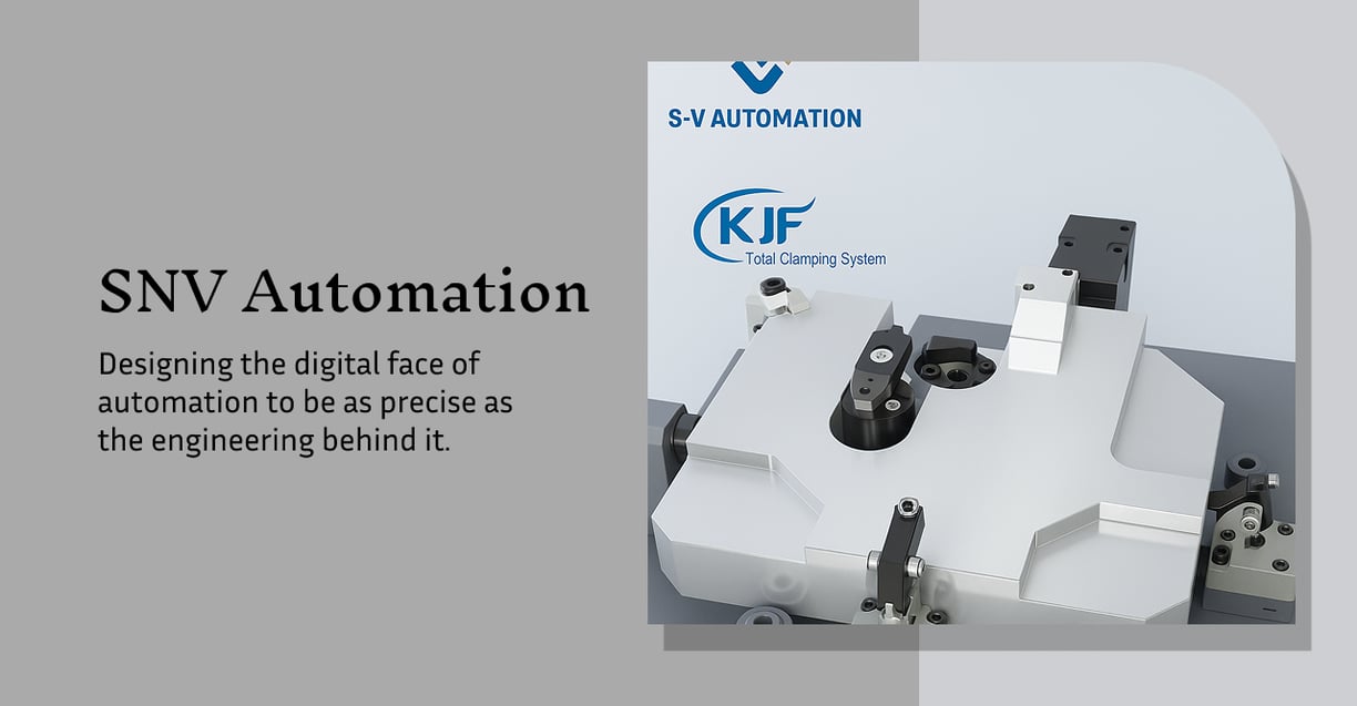
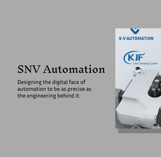
SNV Automation, a Chennai-based industrial automation company, needed a website designed from scratch to establish digital credibility and generate B2B leads. As their UX designer, I led the project end-to-end — from user research to wireframes, UI design, and developer handoff.
The challenge was to design an experience for a highly functional, no-frills audience — engineers, procurement managers, and manufacturing heads — who expect clarity, speed, and reliability over flashy visuals.
Client: SNV Automation
Role: UX Designer
Project Type: End-to-end UX design (new build)
Tools: Figma, Miro, Google Forms
Timeline: April - August
🎯 UX Goals
Design a clean, trust-building digital presence
Prioritize clarity over complexity in presenting industrial services
Create intuitive navigation for a non-tech-savvy B2B audience
Optimize for mobile, as many users browse on-site or on-the-go
Drive quote requests with clearly placed CTAs and minimal friction
🧠 UX Research
To understand user needs, I conducted:
A stakeholder workshop to define goals & offerings
A competitor UX audit of 6 industrial websites
User profiling based on discussions with typical B2B clients
Key UX Findings:
Users wanted quick access to product/service info — no deep menus
Trust elements (certifications, experience, client logos) needed to be above the fold
Forms should be short and direct — overly detailed inquiries create drop-off
The tone should be professional, but not overly technical or cold
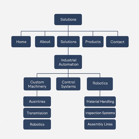
🧭 Information Architecture & Wireframes
I mapped user flows around 3 key actions:
Discovering services/products
Understanding what makes SNV credible
Requesting a quote or contacting quickly
This led to a sitemap focused on clarity:
Home → Quick overview & trust signals
About → Values, experience, mission
Solutions → Industrial services categorized by use-case
Products → Visual product listing with optional spec downloads
Contact → CTA above fold, easy form with key fields only
Low-fidelity wireframes were created to test structure and flow before moving into UI.

🎨 Visual Design Decisions
Used neutral colors, clean grids, and high-contrast CTAs to ensure readability and fast comprehension
Iconography to aid non-native English users or those quickly scanning on mobile
Consistent hierarchy and spacing to guide users through sections without confusion
Designed all screens in Figma with mobile-first responsiveness in mind
🧪 Usability & Developer Handoff
Although no formal usability testing was conducted due to constraints, I:
Ran informal feedback sessions with non-designers (including engineers)
Observed task completion behavior — most users went straight to "Solutions" and "Quote"
Delivered a fully annotated Figma file with components, spacing guides, and developer-ready assets
📈 Outcomes
✅ SNV Automation now has a functional, credible, and conversion-focused digital presence
✅ The quote form became the most visited page after launch
✅ Client praised the layout clarity and structure for helping them close new B2B conversations
💡 UX Learnings
In B2B UX, simplicity wins — it’s about removing cognitive load, not adding flair
Designing without pre-existing content requires strong content structuring and close collaboration with stakeholders
Even small trust indicators (like certs, client logos, years of experience) make a big difference in enterprise UX